DESCRIPTION AND UTILIZATION
OF
THE SANBORN MAP
Compiled from the 1940 and 1953 Editions
Edited by David Hodnefield
The Sanborn Map Company currently is engaged in a long range program of conversion of standard size maps to the NEW REDUCED SIZE MAP, a one quarter size precise replica of the standard size publication.
The diagrams and narrative descriptions printed herein are applicable to both the standard and reduced size publications.
The NEW REDUCED SIZE MAP, which steadily will replace the parent product, is tailored to current underwriting procedures. It is a forward step of progress in map publishing.
SANBORN MAP COMPANY
Executive Offices
10 Cedar St., New York 5, N. Y.
Main Office and Publishing Plant
Pelham 65, N. Y.
Central Department Pacific Department
220 So. State St. 624 California St.
Chicago 4, III. San Francisco 8, Cal.
INDEX
The Sanborn Map (1953 edition)
The Sanborn Map (1940 edition)
Narrative Description – Mercantile Block
Narrative Description – Mercantile Properties
Narrative Description – Residential Block
Narrative Description – Residential Properties
The Sanborn Map – Utilization
The Sanborn Map – Mapping
The Sanborn Map – New Reduced Size
Future Correction Procedure
Additional Diagrams
THE SANBORN MAP (1953 edition)
In recent years Sanborn Maps have been usefully employed in many fields in addition to the fire insurance industry. They render a broad and valuable service to governmental and business organizations concerned with the physical make-up and development of cities and towns.
To the end that the users of Sanborn Maps may readily familiarize themselves with the salient features of the publications the descriptive matter on the following pages has been prepared.
In this booklet it is impossible to portray all types of construction encountered in our daily work. However, a thorough study and understanding of this booklet should be of material aid in the utilization of our maps.
Diagrams are attached with a detailed narrative description of the information contained in typical city blocks shown by the Corporation’s standard colors and symbols.
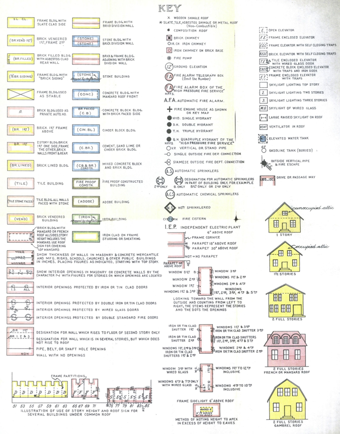
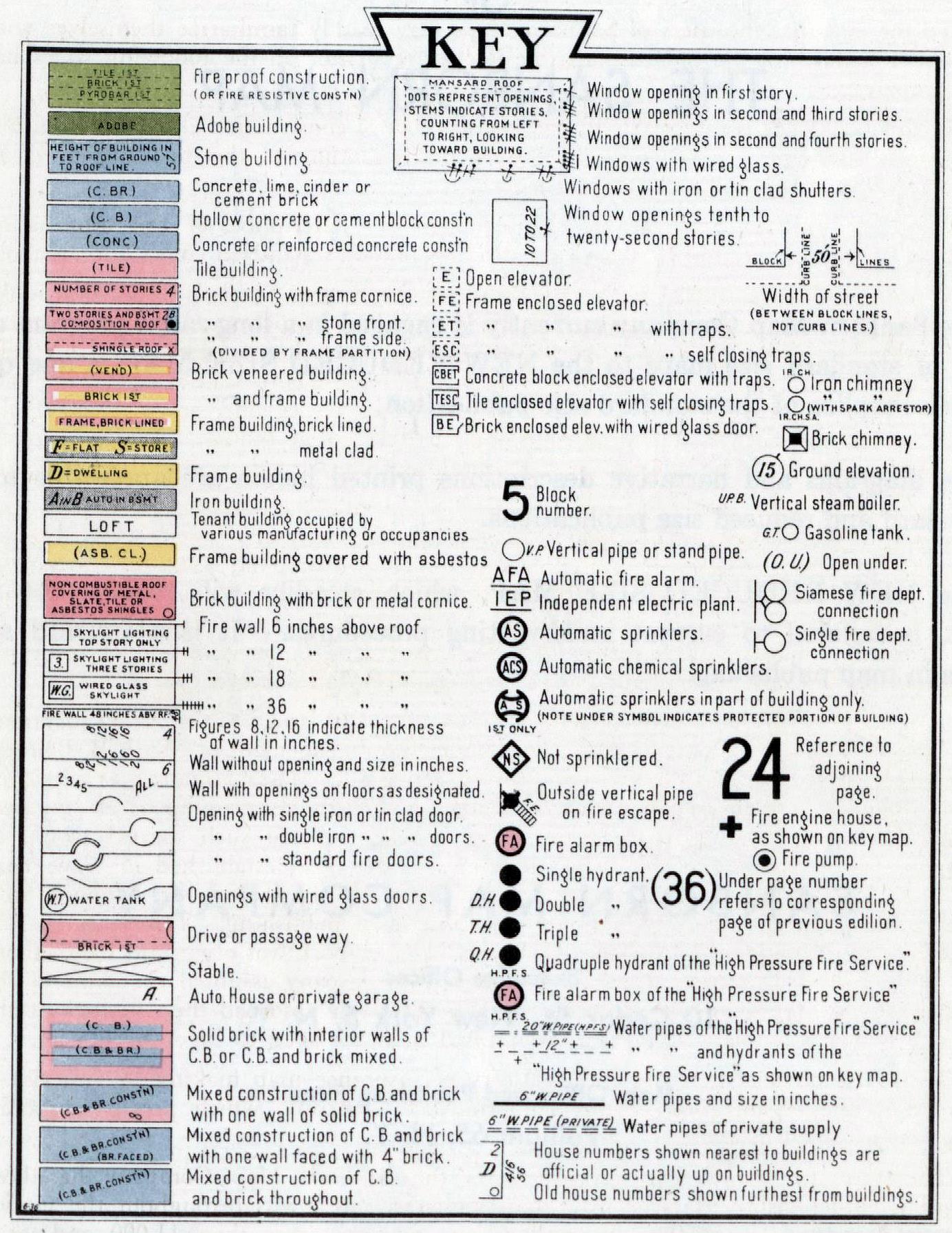
We also include a small scale reproduction of our Key to Symbols appearing in the front of all the Company publications. The first requisite of quick and intelligent reading of the maps is a thorough knowledge of the symbols and colors appearing on this Key. The primary object of the Sanborn Map is to picture buildings to scale in such a manner that the user can envisage all of the physical characteristics and occupancies of the buildings and the nature of the surrounding territory, even though the user may be totally unfamiliar with the city in which the buildings are located.
The origin of fire insurance maps dates back more than one hundred years. Previous to the year 1850 Mr. George T. Hope of New York, Secretary of the Jefferson Insurance Company, conceived the idea of a map of the congested district of New York to replace the old time street register and actually had several sheets drawn. In 1850 Mr. William Perris at the instigation of Mr. Hope undertook to make a survey of New York City. In 1852 he issued “maps of the City of New York, surveyed under direction of insurance companies of said city by William Perris, civil engineer and surveyor”.
In June 1856 we find a copyright for an insurance map issued to the Aetna Insurance Company through its Cincinnati office, then under the management of Mr. J. B. Bennett. In 1866 Mr. D. A. Sanborn, a civil engineer of Somerville, Massachusetts, was employed by Mr. Bennett to map certain towns in Tennessee. With his training as an engineer and his knowledge of maps he was not long in deciding that such surveys would be serviceable to all companies alike and, therefore, in that year established in New York the D. A. Sanborn National Insurance Diagram Bureau. Hence, to Mr. Sanborn must be given the pioneer honors of national insurance map publishing. Ten years later at the office of the Continental Insurance Company in New York was organized the Sanborn Map & Publishing Company, Limited. In 1899 the company assumed the name of the Sanborn Perris Map Company, Limited, at which time it absorbed the activities of the Perris & Brown Company whose operations had been confined to New York City.
Thus it is obvious that the entire history of insurance map making in America is included in the organization of the Sanborn Map Company, which present corporate name was assumed in 1902.
Therefore, for more than seventy years the Sanborn Map Company has been expanding and revising its large scale maps of cities and towns throughout the United States and insular possessions. Its publications number more than 11,000 and, as a general statement, include maps of every United States town of 2,000 or more in population. These maps always have been accepted as the most accurate and detailed building and construction record extant. They are of inestimable worth, not alone to the Fire Insurance Industry, but also to Private Research, Governmental and Municipal Agencies and Public Utilities.
THE SANBORN MAP (1940 edition)
This booklet sets forth the manner in which the users of Sanborn Maps may readily familiarize themselves with the salient details of our publications. Many requests from customers have been received for descriptive matter outlining the best method of utilizing our maps. While it should prove of the greatest value to those with little experience with our maps, we are convinced that it will be successful in refreshing the memories of all in reviewing this subject.
Two diagrams are attached with a detailed narrative description of the information contained in typical city blocks shown by the Corporation’s standard colors and symbols.
In this small booklet it is impossible to typify all types of construction encountered in our daily work. However, a thorough study and understanding of this booklet should be of material aid in the utilization of our maps.
We also include a small scale reproduction of our Key to Symbols appearing in the front of all the Company publications. The first requisite of quick and intelligent reading of the maps is a thorough knowledge of the symbols and colors appearing on this Key.
If your local agent is instructed to refer to map locations in his daily report, will he not facilitate your work in quickly and properly locating each risk? Isn’t this particularly true in a large city covered by a series of volumes? The agent may save time in the Home Office by reporting the volume and page number of each risk, thus eliminating the necessity of reference to the General Index covering the series of volumes. Shouldn’t this practice be further encouraged with your agents?
All our publications are made from actual inspections of the buildings and field conditions by our own engineers made on each and every property.
Whenever a building is in course of construction we note it as made from plans pending the physical inspection of the completed building; in the succeeding correction or revision our surveyor checks the map with the actual construction of the building and eliminates the notation from plans.
The Sanborn Map Company has been publishing fire insurance maps for over seventy years, and has been accepted as an essential in the underwriting departments of all fire insurance companies. The great care exercised in each operation in the compilation and publication of our products makes them accurate and complete to the highest possible degree.
This valuable guide in underwriting, setting forth a wealth of practical information to aid in assuming underwriting risks, is available for daily use. It is to your individual advantage to thoroughly understand the maps to gain their maximum value in your underwriting work.
The time spent in a thorough study of the following pages will well repay you.
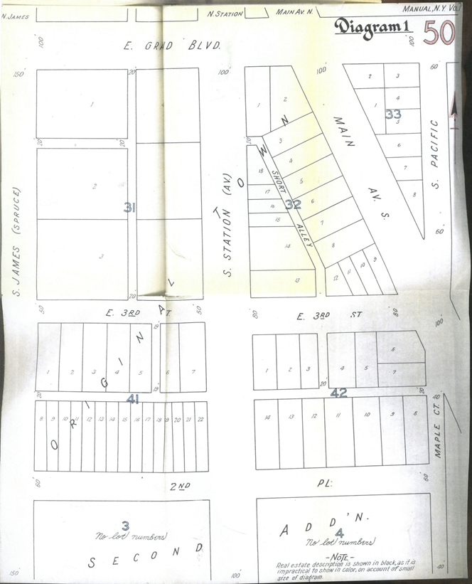
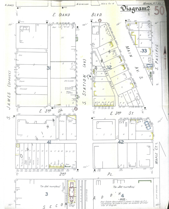
NARRATIVE DESCRIPTION-MERCANTILE BLOCK
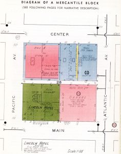
The scale of this illustration is 50′ to the inch and the location as to direction is indicated by the meridian in the right margin of the page. Location: The block is bounded on the North by Center St., East by Atlantic Ave., South by Main St., and West by Pacific Ave. All thoroughfares are 50′ in width as indicated by the figures at the extremity of each street. This block is elevated 42′ above city datum as indicated by the figure in the circle at the intersection of Pacific Ave. and Center St.
The number of the block is 28 as indicated by the prominent figure in the center of the 10′ alley which divides the block into equal portions. This number represents the official designation for the block provided by the city or an arbitrary designation supplied by the Sanborn Map Company in the absence of a suitable official number.
Public Fire Protection: On Main St., there is an 8″ water main, indicated by lines in the center of the street, which terminates at the west side of the intersection of Pacific Ave. and Main St. The termination or “dead end” is indicated by the short line at the end of and at right angles to the water pipe line. This water main supplies two triple hydrants (three connections) which are indicated by large black dots on the northwest corners of Pacific Ave. and Main St. and Atlantic Ave. and Main St.
On Atlantic Ave., there is a 6″ water main which has no connection to either the 8″ pipe on Main St, or the 10″ pipe on Center St. Its independence is indicated by the semi-circle at the points of intersection.
On Center St” there is a 10″ water main, identified as heretofore, which supplies a double hydrant (two connections) on the northwest corner of Center St. and Atlantic Ave., and a quadruple hydrant (four connections) at the northwest corner of Center St. and Pacific Ave.
At the northeast corner of Main St. and Atlantic Ave., there is a fire alarm box as indicated by a circle containing the letters F. A. on a red background. This is a municipal box through which a fire may be directly reported to the municipal fire alarm headquarters.
NARRATIVE DESCRIPTION-MERCANTILE PROPERTIES
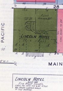
No. 5 MAIN STREET
Size: 100′ x 100′.
Occupancy: Hotel building as indicated by the name.
On the first floor in the southwest corner of the building there is a drug store S, the extent of which is indicated by a broken line, 50′ x 15′. Adjoining this to East is a florist shop S, 30′ x 15′. At the southeast corner there is a haberdashery S, 40′ x 30′. In the northeast corner of the building there is a restaurant Rest., 50′ x 50′, the kitchen for which is located directly underneath in the basement, as indicated.
Construction: With the exception of the 50′ x 50′ section in the northeast corner, the main part of the building contains ten stories as indicated by the figure in the southwest corner and is I06′ in height from the street level to the roof level as indicated by the figure in the center of the Main St. side of the building.
The 50′ x 50′ section in the northeast corner of the building contains only one story as indicated by the figure in the northwest corner of this section and is 14′ in height from the street level to the roof level.
This building is of fireproof construction as indicated by the brown color. It was built in 1932 of non-combustible materials as indicated by the construction note in the lower margin of the page. The frame work is steel directly protected by concrete plaster. Floors and roof are of concrete construction. The curtain walls are 12″ masonry all floors. The masonry consists of 8″ tile blocks faced with 4″ standard bricks. All interior partitions throughout are of 4″ tile.
The roofs of both sections of this building are covered with composition roofing as indicated by the small black dots in the southeast and northeast corners.
There are two tile enclosed elevator shafts indicated by the 10′ x 10′ squares in the center of the building inside of which are the letters T. E. Directly adjoining the elevators is a tile enclosed stair tower indicated as Stairs.
There are windows in all stories from the 3rd to the 10th floor inclusive in the east side of the main section of the building. The existence of windows is indicated by the window symbol with the number of floors indicated thereby. In the rear of both sections of the building there are windows in each story as indicated by the symbols.
Extending from the 1st story on the front of the building is a 10′ x 40′ iron awning indicated by the grey color and broken line. The roof of this awning is metal as indicated by the open circle.
Fire Protection: In the center of the building is a vertical pipe which extends from the basement to the roof. This is indicated by a small circle with the letters V. P. On each floor, there is a hose connection to this vertical pipe on which are attached 100′ of 2-1/2″ fire hose, as indicated by the note.
All of the exposed windows on the east and north sides of the building contain standard wire glass in metal frames, shown by a line at right angles to and outside of the window symbol.
The exterior walls on the north and east sides of the building extend 2′ above the roof line forming fire walls (parapets). This fact is indicated by an extension of the wall line into the street with cross lines, each one of which represents 6″ above the roof line.
Miscellaneous Information: This building is completely equipped for air conditioning as indicated by the note (Air Cond.). There are ducts throughout which convey air from one floor to another. The fan machinery connected with this system is located in a separate house on the roof as indicated by a note in the building.
Letters A, B, and C in the front of the building on Main St. are arbitrary identifications supplied by the Sanborn Map Company for the three stores on the first floor. These identifications were necessary in the absence of official numbers actually posted on the building.
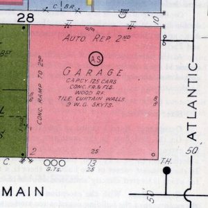
No. 13 MAIN STREET
Size: 100’X100′.
Occupancy: Public garage as indicated by the designation in the center of the building. Private garages are indicated as such. The owner’s name is omitted as the building is not of sufficient importance and the risk is more commonly known by the street number. The majority of the building is utilized for auto storage with a capacity of 125 cars, as indicated by the note. Repairing is done in the rear of the second floor, as indicated by the note Auto Rep. 2nd.
Construction: A two story building 25′ in height from the street level to the roof level as indicated by the figure in the front of the building.
The building has a concrete frame and concrete floors. All of the exterior walls are of curtain type containing 8″ tile blocks both floors. The size of the walls is indicated by the two figures on the inside of the rear and side walls. The building is of non-combustible construction up to the roof, which is of wood as indicated by the note, with a tin covering as indicated by the symbol (open circle) in the southeast corner of the building. The building is colored red in recognition of tile blocks as the principal masonry.
The west wall of the building is blank but there are windows in both stories of the north wall adjoining the alley. Each stroke of the window symbol indicates a story and to determine which story the windows are in, it is necessary to count the strokes from left to right after facing the wall.
The second floor of the building is lighted by nine wire glass skylights irregularly located in the roof. The existence of skylights is indicated by the note 9 W. G. Skyts. There are no elevators in this structure since autos have access to the second floor via a concrete ramp as indicated by the note on the west side of the diagram.
Fire Protection: The entire building is completely equipped with an automatic sprinkler system as indicated by the symbol, @ . This system is supplied with water via a connection to the municipal 6″ water main as indicated in the center of Atlantic Ave. There is also a fire department connection at the northeast corner of the building as indicated by the symbol, ~.
The exterior walls on the two exposing walls, i. e. the west and north walls, extend at least 1′ above the roof line forming fire walls.
Miscellaneous Information: The gasoline supply for this garage is stored in three tanks buried under Main St. just in front of the building. The location of a tank is indicated as follows: G.T. Ο
The number 25 outside of 13 Main St. indicates the street number that formerly applied to the building.
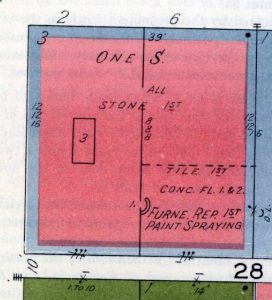
No. 2-6 CENTER STREET
Size: 100′ X 100′.
Occupancy: A furniture store occupies the entire building. The occupancy is indicated as One Store in preference to the usual designation S in order to convey the fact that both sides of the building are occupied by the same firm. A space 50′ x 40′ in the southeast corner of the first floor of No.6 Center St. is utilized for the repairing of furniture, including paint spraying, as indicated by the note.
Construction: The red color with the blue border indicates ordinary masonry construction. The blue color indicates stone on the first floor and the red color brick walls above to the roof.
There are three stories to this building and it is 39′ in height from the ground level to the roof level, as indicated by the figures in the front.
The exterior walls are 16″ stone on the first floor and 12″ brick on the floors above. J The wall thickness is indicated by the figures alongside of the west exterior wall and the east exterior wall. The latter is a party wall on the first floor. Therefore, the figure for thickness straddles the wall line. The building is divided into two equal portions by an 8″ brick wall, as indicated.
The floors are ordinary wood joist construction except in the southeast section of the building where concrete floors are below and above the repairing department. No mention is made of the wood floors since in ordinary construction floors are assumed to be of wood unless specifically noted. The roof is wood covered with a composition roofing paper, as indicated by the small black dot in the northeast corner.
The west portion of the building contains an ordinary 10′ x 20′ skylight in the roof.
This skylight conveys light to all three floors via holes in the various floors as indicated by the small rectangle in the center of the building enclosing the figure “3”.
The rear wall contains windows in all floors. The east wall contains only one window on the first floor. This window is above the roof of the adjoining one story building, as indicated by the letters O. L., meaning overlooking.
The division wall in the center of the building contains a communication from one section to another on all floors, as indicated by the break in the line and the word All. Another break in the wall line, nearer the alley, is a communication on the first floor only, as indicated by the figure “I”.
Fire Protection: The hazardous furniture repairing department in the southeast corner of the first floor is cut off from the rest of the building by a 4″ tile wall, 40′ from and parallel to the rear wall. This is indicated by the broken line with the note Tile 1St. This first floor department is further protected by a standard metal fire door on the inside of the doorway as shown by the double curved line, the window in the east wall is protected on the outside by a metal shutter as indicated by the single curved line, and the first story window on the alley contains wire glass in a metal frame, as indicated by the line on the outside of the symbol for the first floor window.
The rear wall does not extend above the roof, as indicated by the omission of the fire wall symbol. The center partition extends to but not through the roof. The east wall extends above the roof from r’ to 3′ as indicated by the fire wall symbol with two cross strokes which indicates the minimum height of 1′.
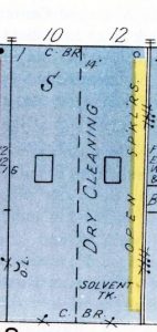
No. 10-12 CENTER STREET
Size: 50′ x 100’.
Size: 50′ x 100’. Occupancy: No. 10 is a stationery store, indicated by the letter S. No. 12 is a dry cleaning establishment, as indicated by the note. Construction: A one story structure, 14′ in height from the street level to the roof level as indicated by the figures in front of the building. It is divided equally by a wooden frame partition shown by a broken line. The west wall, as previously described, is a 16′ stone party wall. The east wall is stucco over wood, as shown by the yellow color which represents wood. No consideration is given to ordinary stucco plaster. The front and rear walls are both of sand lime brick, indicated by the abbreviation C. Br. This abbreviation is used to indicate all types of non-standard brick, such as concrete, cinder, or sand lime bricks. With the exception of the yellow strip on the east wall, the entire building is colored blue because both types of masonry used are customarily colored blue.
The floor and roof construction is assumed to be wood since it is not otherwise noted. The roof has a metal covering, as indicated by the open circle in the northeast corner. There is a 5′ x 10′ ordinary skylight in the roof of each section, as indicated by the outlines in the center of each division. There is a window in the rear of each division of the building, as indicated by the symbols.
Fire Protection: None.
Miscellaneous Information: In the rear of the dry cleaning establishment there is a 100 gallon tank of semi-combustible cleaning fluid as indicated by the notation Solvent Tk.
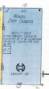
No. 16 CENTER STREET
Size: 50′ x 100′.
Occupancy: A wholesale dry goods office and store house building, as indicated by the specific note.
Construction: The building contains four stories and is 43′ from the street level to the roof level, as indicated by the figures in the front of the building. The frame, floors and roof of this building are of reinforced concrete and the curtain walls are of 8″ concrete blocks all floors. The building is, therefore, non-combustible, but an exception is made because of the existence of concrete blocks, as indicated by the construction note. The building was erected in 1928.
The concrete roof has a covering of tar and gravel, as indicated by the symbol for composition roofing in the northeast corner.
Adjacent to the west wall, 50′ back from Center St., there is a 10′ x 10′ brick elevator shaft, indicated by the solid outline enclosing the letters B. E. The break in the elevator outline indicates an ordinary frame door all floors.
There are no windows in the first story of the west wall, but windows exist in all stories above. This fact is indicated by the symbols. The four strokes of the symbol indicate four stories of the building and the three dots on the inside end of these strokes indicate windows 2nd, 3rd, and 4th only. The rear wall on the alley has windows all stories.
Fire Protection: The building is partially equipped with automatic sprinklers, as indicated by the symbol @. The exact location of the sprinklers is indicated by the note Except 1St beside the sprinkler symbol. Over each of the windows of the west wall is an open sprinkler head, as indicated by the note Open Spklrs. The system is supplied with water from the municipal system via a connection to the 6″ main in Atlantic Ave.
There is also an outside fire department connection as indicated by the symbol ~. The windows in the rear wall are protected by an outside iron shutter as shown by the single curved line around the window symbol.
The south wall extends 12″above the roof, as indicated by the parapet symbol with two cross lines, and the west wall extends 18″ above the roof, as indicated by the symbol with three cross lines.
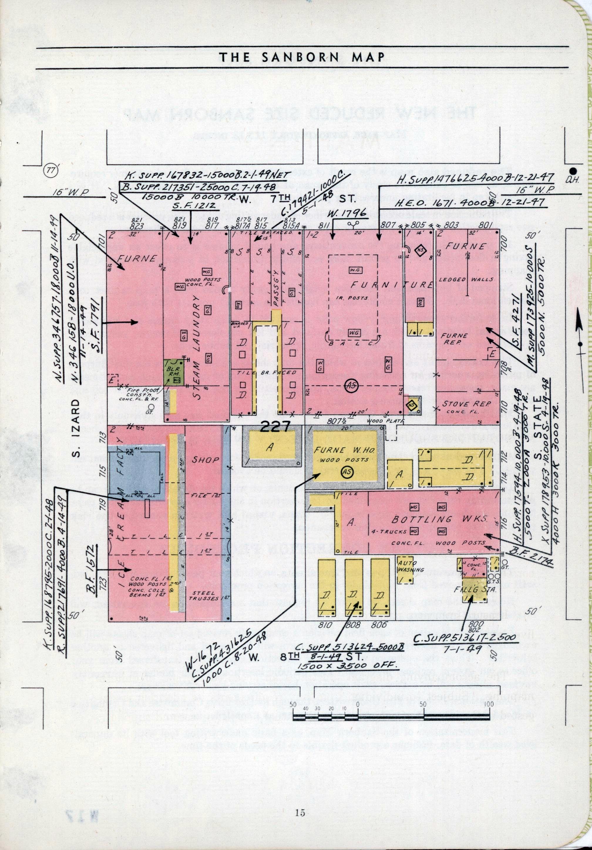
NARRATIVE DESCRIPTION-RESIDENTIAL BLOCK
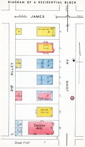
Location and Size: This block is bounded on the north by James Street; on ·the west by Second Alley; on the east by John Avenue, and on the south by a small unnamed alley. The directions are indicated by the meridian appearing at the right of the diagram. The scale fifty feet to an inch is also indicated at the bottom of the diagram.
The street width of John Avenue is shown by the figure 50′ at the northern end of the street. The width of James Street is shown by the figure 40′ at the eastern end. The letters St are omitted after the word “James” as in all our maps where the thoroughfare is a name ending in Street the abbreviation St. is omitted, but the abbreviations for Avenue, Road, Lane, etc., are always shown.
On John Avenue there is an 8″ water main which is indicated by the line at the ends of the street. On James Street there is a 6″ water main which is shown in the same manner at the ends of the street. This main terminates at the western end of James Street as indicated by the short line at right angles to the line of the water main. A double hydrant connected to the main on John Avenue is shown by a circle marked D.H. opposite 10 John Avenue. A fire alarm box is indicated by a circle containing the letters F.A. on a red background opposite 20 John Avenue. The large numbers immediately in front of the buildings facing John Avenue are the official house numbers as they appear on the buildings.
Top of Page
NARRATIVE DESCRIPTION-RESIDENTIAL PROPERTIES
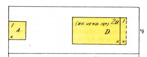
No. 4 John Avenue: Occupancy is indicated by letter D which means a private residential building occupied by not more than two families. The yellow color indicates frame construction. The first floor has a veneering of brick as indicated by the note (Br. Vend. 1St). However, this does not affect the coloring. The story height, designated by 2B in the left hand corner, indicates two full stories over a basement. The latter would not be indicated unless the floor was below the ground and the ceiling at least 4′ above ground. The roof is wood covered with wood shingles, as indicated by the small cross in the right hand corner. Wood roofs are never specifically noted unless they are the only exception to an otherwise fire-resistive building. On the front of the building, there is an open frame porch, one story in height, with a wood shingle roof covering.
At the rear of the lot, there is a one story frame private auto house, indicated by the letter A with a wood shingle roof covering. This building may be occupied by not more than two cars, otherwise the capacity would be noted.
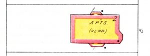
No.8 John Avenue: A residential building occupied by several families, with at least two per floor, as indicated by the note Apts. meaning apartments. The construction is frame completely veneered with brick, as indicated by the yellow color with a red border and the note (Vend.). Unless specifically noted, a masonry veneer rarely exceeds 4″ in thickness. The building has two stories with the exception of the bays on either side which are one story. The covering of the roof, as well as the bays, is composition as indicated by the black dot.
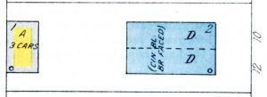
No. 10-12 John Avenue: A residential building occupied by two families, as indicated by the letter D each side of the dotted line. The latter represents a frame division which implies that there is a separate entrance to each side. The exterior walls are cinder block faced with ordinary brick, as indicated by the blue color and the note (Cin. BI., Br. Faced). The color refers to the basic material which, in this case, is cinder block. There are two stories, as indicated. The roof is covered with a non-combustible material, as indicated by the small circle in the upper right hand corner.
In the rear of the lot there is a one story private auto house, indicated by the letter A, with capacity for three cars, as indicated by the note. The construction is wood frame, clad with metal, as indicated by the yellow color with the gray border. The roof covering is non-combustible, as indicated by the small circle.
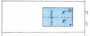 No. 14-16 John Avenue: A residential building occupied by six families, as indicated by the letter F each side of the frame division wall, which is indicated by the dotted line. The letter F, meaning flat, indicates a single family occupancy per floor each side. It is applied to buildings of more than two floors with a single family occupancy per floor. The construction is solid stone for the first two floors, as is indicated by the blue color without any note. The half story, or attic, is occupied and of frame construction, as indicated by the note. The roof covering is composition, as indicated by the black dot.
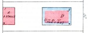
No. 20 John Avenue: .A residential building occupied by not more than two families as indicated by the letter D. The construction is 8″ or more of cinder brick the first floor and 6″ or more of tile the floors above, indicated by the note, and blue and red colors. There are three stories and the roof covering is composition, as indicated by the symbol.
At the rear of the lot, there is a one story auto house, indicated by the letter A, with a capacity of three cars and with two masonry partitions making three stalls. When non-combustible partitions exist in an auto house, the capacity is always indicated by stalls rather than in cars. The construction is solid brick, as indicated by the red color. The roof covering is composition, as indicated by the symbol.
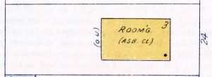 No. 24 John Avenue: A residential building containing more than ten rooms used for lodging purposes, as indicated by the note Room’g. This designation of occupancy applies to either boarding, rooming or tourist homes when they contain in excess of ten rooms for lodging purposes. The construction is wood frame clad with asbestos shingles, as indicated by the yellow color and the note (Asb. Cl.). The building has no basement and is open to the elements between the first floor and the ground, as indicated by the abbreviation (O.U.) at the rear of the diagram. The story height is three and the roof covering is composition, as indicated.
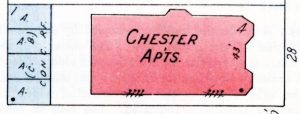
No. 28 John Avenue: A multiple family residential building as indicated by the name Chester Apts. The presence of a name on the building implies that it is more commonly known by the name than by the street number. The construction is solid brick, as indicated by the red color. The story height is four and the roof covering is composition. The height in feet from the ground to the eaves, or roof level, is 43′. The height is always indicated for apartment buildings containing four or more stories. The existence of windows is shown by the symbols in the side wall adjoining the alley. It is customary to show windows in masonry buildings of any character, except private auto houses, when they are on or within 5′ of alley lines.
In the rear of the lot, there is an auto house, indicated by the letter A, with four separate compartments. The wall construction is of concrete block, as indicated by the blue color and the abbreviation (C.B.). The roof covering is concrete with composition covering. The solid division walls are drawn to indicate the complete cut off of each compartment caused by the concrete roof.
Top of Page
THE SANBORN MAP
UTILIZATION
The Fire Insurance Map serves numerous diversified industries and purposes. This accurately scaled visual depiction of street layout, building location and construction, exposures, occupancies, fire hazards and fire protection, first and foremost constitutes a valuable guide to the fire and casualty underwriter.
FIRE INSURANCE COMPANIES maintain complete nationwide files of Sanborn Maps in their principal offices. They form an ever present graphic record for review and underwriting of individual risks, as well as block liability as daily reports are received from the field. They substantially aid the Insurance Companies in the maintenance of the principle that sound insurance is based upon the dispersal of risk among geographical locations, not concentrated in single areas.
“Mapping”, the noting of liability on the face of the map, is an important function in underwriting. Insurance Companies utilize the map as a source of original entry on individual risks, generally recording such information as policy numbers, expiration dates, amounts of net retention, distribution of liability between buildings and contents, thus completing a visual record of current commitments.
LOCAL FIRE INSURANCE AGENTS are equipped with Sanborn Maps of their respective cities and towns. Their careful indentification (sic) of risks by map volume, page, block and house number on daily reports renders a helpful time saving service to Companies and Agents alike. The map assists the local agent in rendering prompt intelligent service to the assured and provides a source of verification of property descriptions as they appear on daily reports.
Maps are kept to date by correction slips made from periodic field surveys covering changes since the previous inspection of the territory. It is important that agents’ maps be corrected to date to be sure they are identical with the maps held by the Home Office, thus precluding the possibility of confusion in the identification of risks.
Various governmental agencies, federal, state, county and municipal, now rely on Sanborn Maps to save costly field inspections and as a means of permanently recording valuable information from time to time. The maps are widely used by municipal and county departments such as Building, Education, Engineering, Health and Sanitation, Highway, Planning and Zoning, Public Libraries, Public Works, Sewer, Tax Assessors, Water, and City Managers.
Utility Companies find them invaluable as an original record of their outside plant data.
Banks, Mortgage and Life Insurance Companies utilize them in underwriting mortgage loans, recording their commitments much in the manner of the Fire Insurance Companies.
In recent years the Sanborn Map Company has developed special market analysis maps, converting for marketing studies the wealth of detail of individual communities appearing in the standard fire insurance map.
Sanborn’s nationwide corps of field engineers and publishers, functioning over the past three-quarters of a century, have accumulated an unparalleled record of the physical growth and current status of municipalities throughout the country. The facilities of the Company are available for special surveys upon request.
THE SANBORN MAP
MAPPING
On the illustrated below is a typical method of recording liability. Mapping of daily reports is an important initial step in underwriting.
The exercise of care, legibility and uniformity materially aids the underwriter in quickly visualizing the details of the risk involved.
The degree of uniformity employed in placement of lines bears importantly upon subsequent map correction operations.
In the use of the STANDARD SIZE MAP lines are inscribed directly on the map pages. Therefore lines written within buildings frequently must be transferred as correction slips are attached. This involves the double operation of removal and subsequent replacement, embodying some risk of transposition of figures.
Uniform placement of lines and survey numbers within streets with arrows pointing to the risk often precludes these operations and serves a common purpose of saving the time of mappers, underwriters and map correctors.
Erasure from map pages of expired lines lessens confusion of obsolete and live data.
The accompanying diagram illustrates an accepted method of uniform mapping. Subject to individual Company requirements its adoption is suggested in the interest of cooperative and mutual benefit to user and supplier.
THE SANBORN MAP
THE NEW REDUCED SIZE SANBORN MAP
MAP PAGE APPROXIMATELY 11 X13 INCHES
The reduced size map is the result of extensive research in the field of customer require-ments, as well as exhaustive study of the range of economic production possibilities. It is a forward step in facilitating underwriting procedures.
The reduction in scale occasions no sacrifice of underwriting data. The product is a reduced size reproduction of a full scale master copy of the currently revised publication.
Its purpose in replacing the conventional size bound volume is to effect an appreciable saving in floor space and to permit more economical utilization of personnel concerned with mapping.
Stripped of bulkiness and excessive weight it is easily carried from a map cabinet to a conventional desk. Female employees can handle this compact product with ease.
In its further streamlining, yellow color is omitted in designating frame and veneered residential buildings, which are clearly outlined and left uncolored. However, yellow color is continued on diagrams of frame mercantile, industrial and public risks.
The transparent envelopes in which the map sheets are encased serve the dual purpose of providing a surface for recording permanent identification of risks on which commitments are made, inspection report numbers, etc., and protection of the map sheets against soil and wear. (Please see accompanying exhibit.)
MAPPING on the reduced size map differs from the standard size map style only in that map lines are inscribed on the transparent envelopes together with the accompanying line sheets. NO NOTATIONS SHOULD BE MADE DIRECTLY ON THE MAP SHEETS.
A hard crayon pencil, preferably blue, is recommended for writing on the transparent envelopes. The use of any water soluble crayon should be avoided.
Line Sheets drawn to your specific requirements, on which the detail of each line can be permanently recorded, are recommended for insertion in the binder opposite each map page. (Sample line sheets available upon request.) Thus, visual and written record of the risk involved are combined for quick reference.
FUTURE CORRECTION PROCEDURE
The transparent envelopes and line sheets, on which your penciled data will be noted, will not be removed from your binder in the correction procedure.
However, the map sheets, on which we request that no notations be inscribed, will rotate amongst customers.
Following publication of each field revision a completely revised set of map sheets will be exchanged for your uncorrected set which, in turn, will be revised and delivered to another subscriber. Thus, the operation of attaching correction slips will be transferred from your office to our several regional branches. This periodic insertion in your binder of currently revised sheets will be a clean, swift operation better serving your convenience.
The National Board of Fire Underwriters, through its Executive Committee and Committee on Maps, has endorsed the map conversion program as a constructive one.
This modernization of the Sanborn Map, as a basic underwriting tool with its unparalleled wealth of data, fashions a product flexible to the needs of the time.
Top of Page
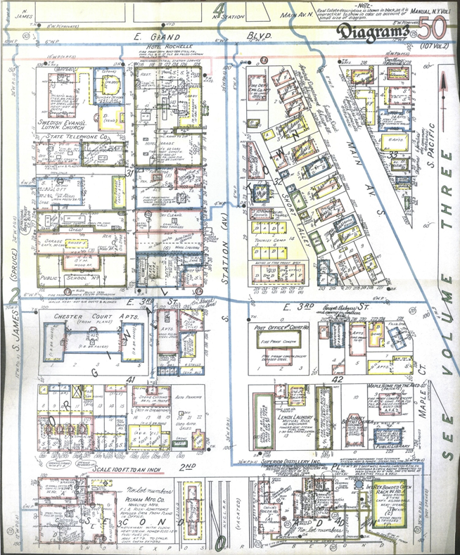
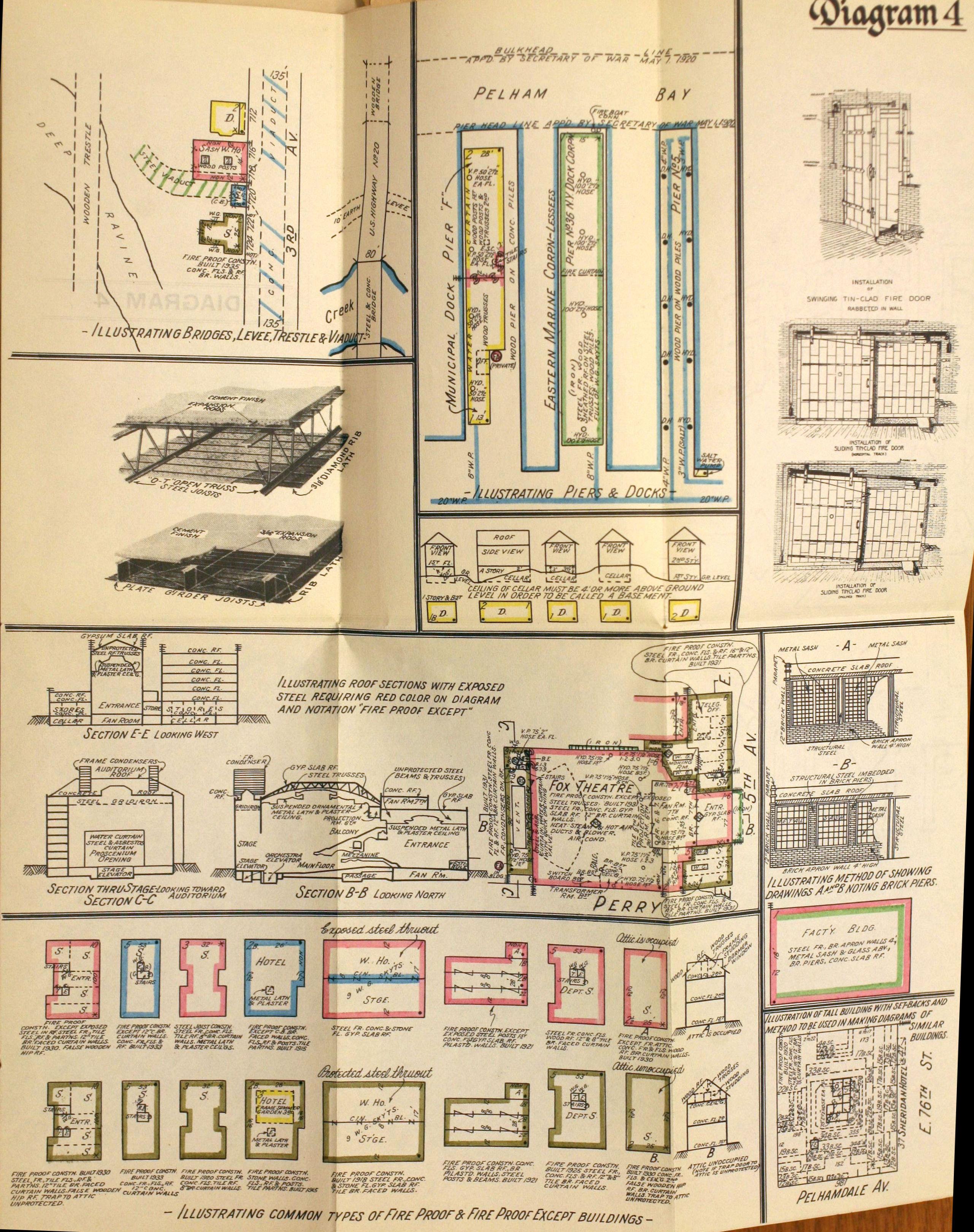
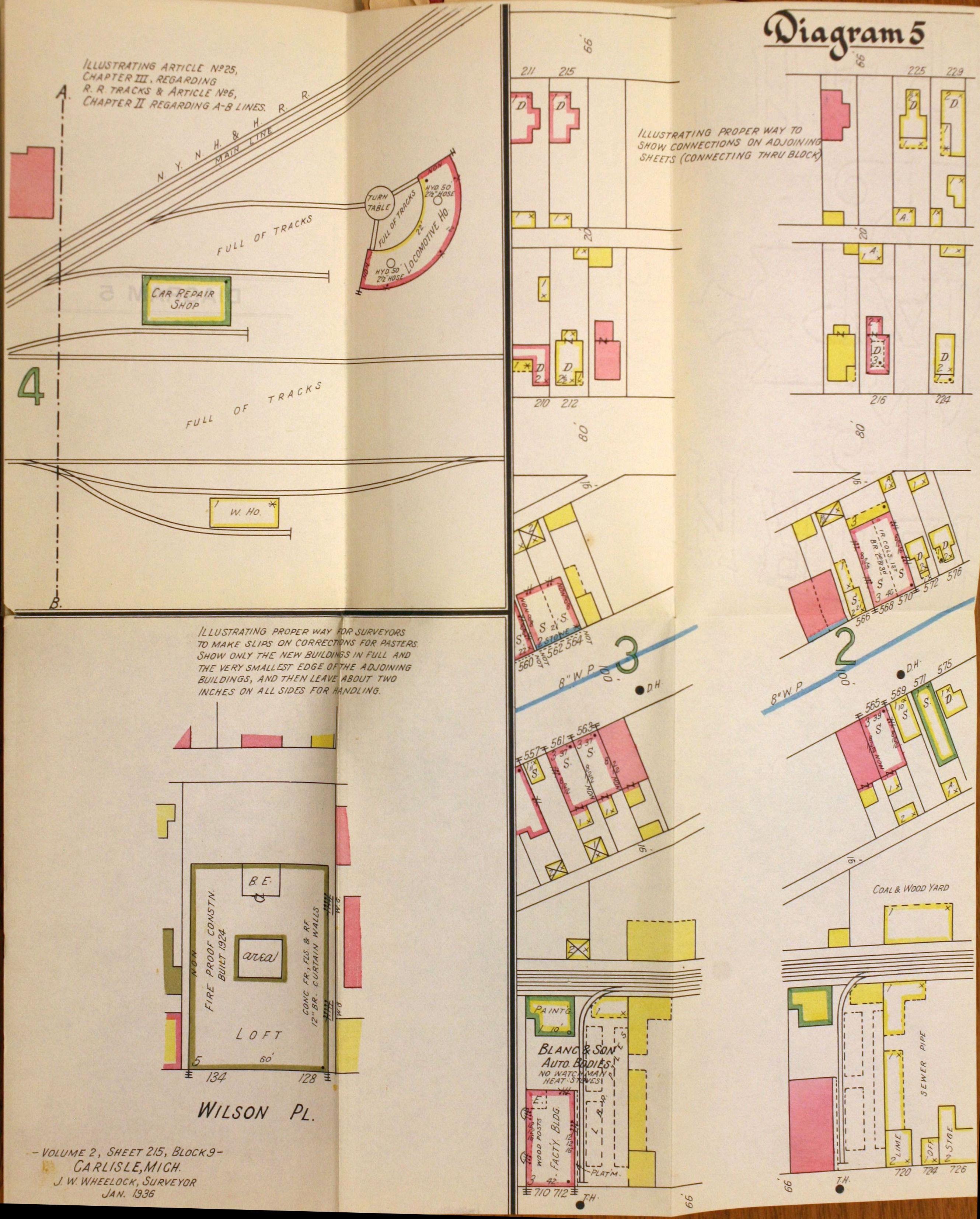
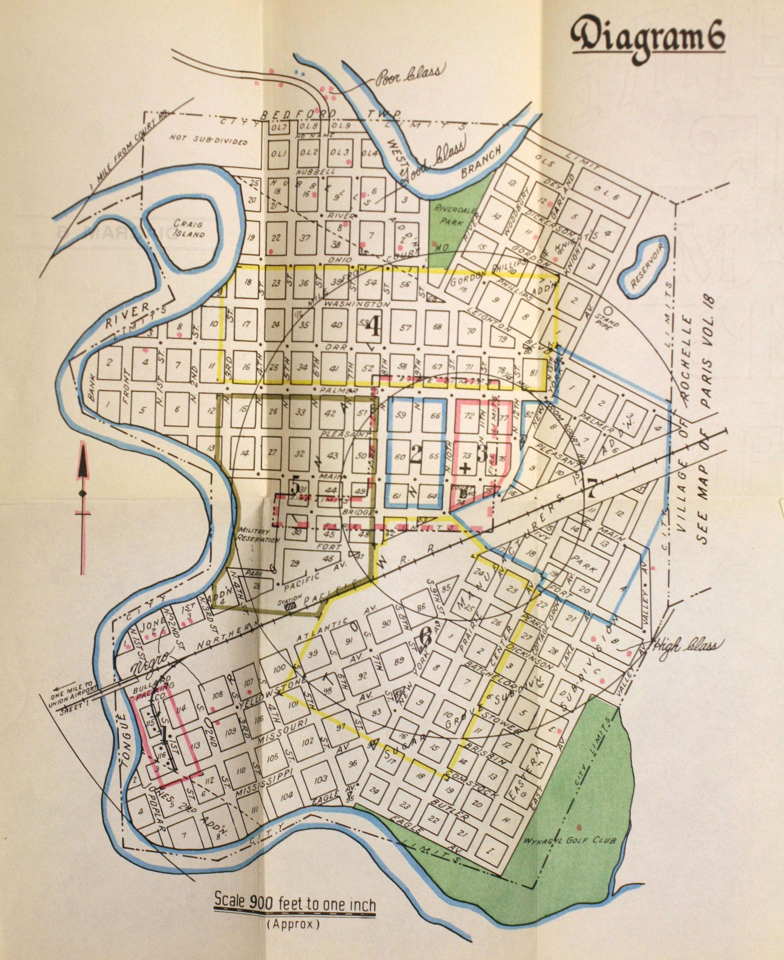
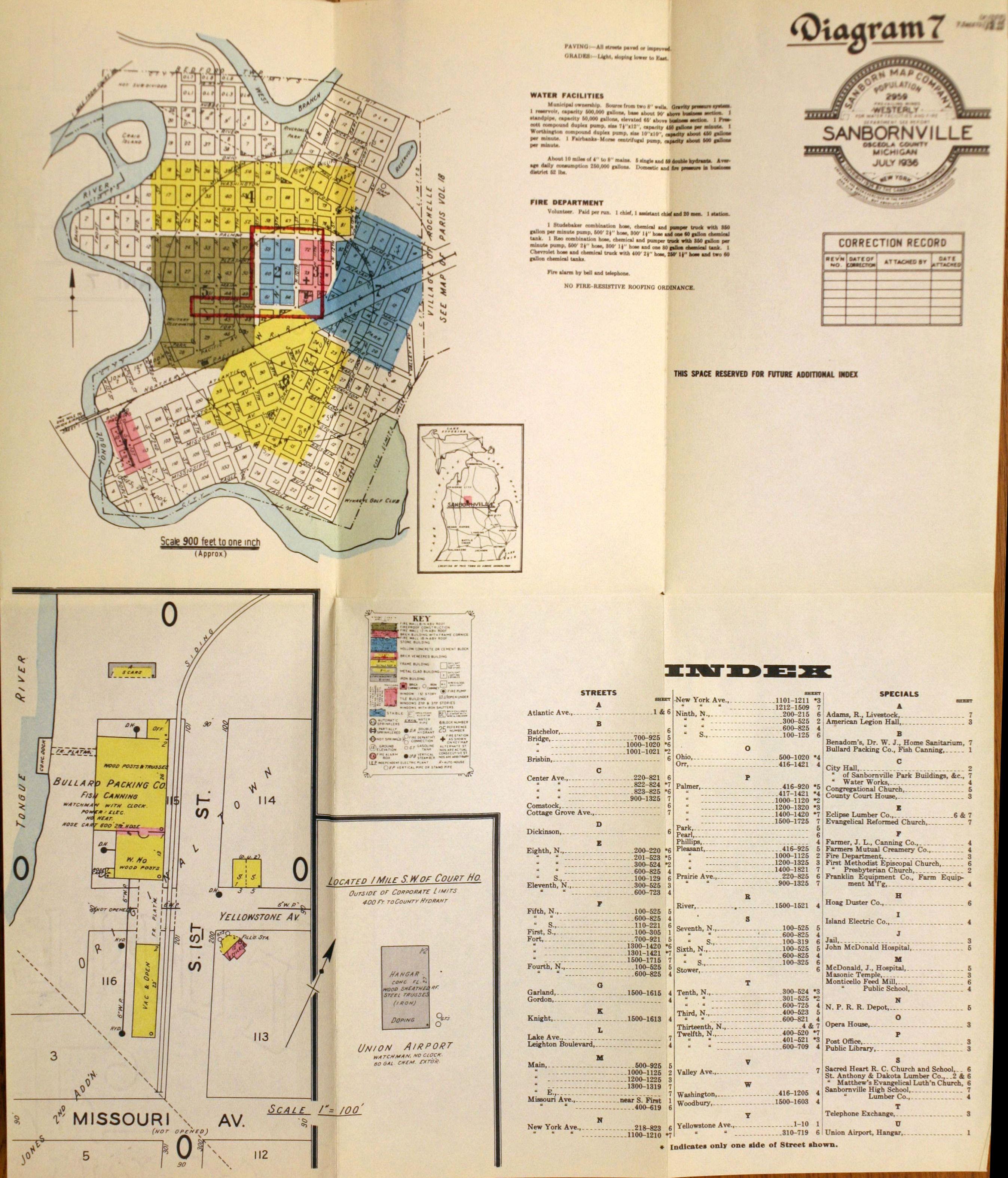
ADDITIONAL DIAGRAMS